The Best Design Tools for Pie Charts and Donut Charts: Professional Templates, Easy Editing, and Results That Actually Communicate
Data is only as useful as your ability to communicate it, and few visuals do that faster than a well-designed pie or donut chart. The problem is that most people building charts face the same frustrating gap: the spreadsheet tools that hold their data produce functional but uninspiring charts, while professional design software requires more time and skill than the task warrants. The right design tool closes that gap by combining real data input with professional templates and enough customization to make the output feel intentional and on-brand. This guide covers what separates a great chart design tool from a mediocre one, and the practical techniques that turn raw percentages into visuals that actually move an audience.
Why Pie and Donut Charts Are Still the Go-To for Proportional Data
Pie and donut charts have been declared obsolete by data visualization purists for years, and yet they remain among the most widely used chart types in business presentations, reports, infographics, and dashboards. The reason is simple: they communicate part-to-whole relationships in a way that is immediately intuitive to virtually every audience. When you show that one product line accounts for 62 percent of revenue, a pie chart communicates that proportion visually without requiring the reader to interpret axes, scales, or trend lines.
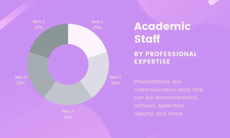
The donut chart is a variation on the pie chart that uses a hollow center, transforming the chart from a solid disk into a ring. This small structural change offers two practical advantages. First, the empty center provides space for a label, a total figure, or a key metric that anchors the chart’s meaning. Second, the ring format is widely considered easier to read than a filled pie because it directs attention to the arc lengths rather than the slice angles, which human visual perception evaluates more accurately. In practice, the choice between a pie and a donut often comes down to whether you need that center space and what aesthetic fits the broader design context.
Both chart types perform best under specific conditions. They work well when there are a limited number of categories, when the proportions between categories are meaningfully different from each other, and when the audience needs to understand the composition of a whole rather than compare values across categories or over time. Understanding these conditions helps you choose when a pie or donut chart is the right tool and when a bar chart, line chart, or other format would serve your data better.
What Makes a Chart Design Tool Actually Worth Using
Not every tool that produces a pie or donut chart qualifies as a design tool. Spreadsheet chart generators produce functional output, but they offer limited control over typography, color, layout, and the surrounding visual context that makes a chart feel like a deliberate design choice rather than a default export. A genuine design tool for charts gives you control over every visual element while making that control accessible through an interface that does not require a design background to navigate.
The features that distinguish a strong chart design tool include a library of professionally designed templates, the ability to apply brand colors and fonts directly to the chart, export options that support both digital and print use cases, and the capacity to integrate the chart into a broader design layout without switching applications. When these features are combined in a single environment, the workflow from data input to finished, shareable chart collapses from a multi-tool process to a straightforward task.
Template quality deserves special attention when evaluating a chart design tool. A professional template is not just a pre-styled chart. It is a carefully considered design that balances color contrast, label placement, legend positioning, and surrounding whitespace in a way that makes the data readable and the visual appearance compelling. Starting from a well-designed template and customizing it for your specific data and brand is dramatically faster and produces better results than building a chart from scratch, even for experienced designers.
10 Tips for Designing Pie and Donut Charts That Communicate Clearly
1. Start With a Template Built for Data Clarity, Not Just Aesthetics
The most common mistake in chart design is choosing a template based on how it looks rather than how well it organizes data. A template with heavy decorative elements, complex backgrounds, or elaborate color schemes might look impressive at a glance but will obscure the data it is supposed to clarify. When evaluating templates for pie and donut charts, prioritize designs where the data is the dominant visual element and the surrounding design supports rather than competes with it.
The best templates for proportional data use clean typography for labels, sufficient contrast between adjacent segments, and enough whitespace around the chart to let the data breathe. They avoid three-dimensional effects, gradient fills that distort perceived segment sizes, and excessive visual noise. Choose a template that you could imagine appearing in a professional report or a boardroom presentation without any modification, then customize it for your specific content and brand.
2. Limit Your Chart to Five or Six Segments Maximum
The readability of a pie or donut chart degrades quickly as the number of segments increases. A chart with two or three segments communicates its proportions almost instantaneously. A chart with eight or ten segments forces the reader to work significantly harder to extract meaning, and the smallest segments become so thin that they are nearly impossible to label or read accurately.
If your data has more categories than a chart can clearly display, there are two approaches worth considering. The first is to group the smallest categories into a single segment labeled “Other” or “All Others,” which preserves the relevance of the major categories while acknowledging that the remaining data exists. The second is to reconsider whether a pie or donut chart is the right format entirely. A horizontal bar chart, for example, handles many categories far more legibly than a pie chart with ten slices. Choosing the right chart type for your data is as important as designing it well.
3. Use an All-in-One Chart Design Tool for Faster, More Consistent Results
The most efficient path from data to a finished, professional chart is a tool that handles both the data input and the design output in a single environment. Adobe Express lets you make a chart directly within a design workspace that includes professional templates, brand customization options, and export tools, without requiring you to build in a spreadsheet application and then redesign in a separate program.
This kind of integrated approach matters most when consistency across multiple charts is a priority. If you are producing a report with six charts that all need to follow the same visual system, doing the work in a single design environment ensures that every chart uses the same fonts, the same color palette, the same label style, and the same proportions. Achieving that consistency when moving data between a spreadsheet and a design application introduces friction and error at every transfer point.
4. Apply a Color Strategy, Not Just Brand Colors
Having access to your brand colors in a chart design tool is the starting point, not the complete answer. Applying brand colors well to a pie or donut chart requires a strategy for how those colors are assigned to segments, how they contrast with each other and with the background, and whether the colors carry meaning beyond simple differentiation.
A reliable color strategy for pie and donut charts assigns the most visually prominent color to the most important segment, uses lighter or more neutral shades for supporting segments, and ensures that no two adjacent segments are so similar in value that they are difficult to distinguish. If your brand palette includes only two or three distinct colors, extend it with tints and shades of those colors rather than introducing colors from outside the palette. Consistency within a palette is more visually coherent than introducing new colors for differentiation.
5. Label Directly on or Near Segments Rather Than Relying on a Legend
Legends create a translation step that slows down reading. When a reader sees a segment in a chart and then has to look away to a legend to identify what it represents, their comprehension of the data is interrupted by a navigation task. Direct labeling, placing the category name and percentage value directly on or adjacent to each segment, eliminates this interruption and makes the chart readable at a single glance.
Most professional chart templates include direct label placement options. In a donut chart, the center space can hold a total figure or the name of the primary category, with percentage labels positioned around the ring. In a pie chart, labels can be placed inside segments for larger slices and connected with a leader line to external labels for smaller ones. If your chart has segments too small to label directly, that is a signal to reduce the number of segments before worrying about label placement.
6. Use the Donut Center Space Intentionally
The hollow center of a donut chart is one of its most distinctive and useful design features, and leaving it empty is a missed opportunity in most contexts. The center is prime visual real estate that can hold the total figure being represented, the title of the chart, a key metric derived from the data, or an icon that reinforces the subject matter.
Whatever you place in the center should complement the data rather than duplicate it. If every segment is already labeled with its percentage value, placing a total count in the center adds useful context without redundancy. If the chart represents the composition of a budget, placing the total budget figure in the center anchors the proportions in a concrete number. Keep the center content concise: a number, a brief label, or a small icon communicates more effectively than a sentence.
7. Match Chart Size to Its Display Context
A chart that looks well-proportioned in a design editor can appear too small to read when embedded in a presentation slide, or overwhelmingly large when placed inline in a report document. Chart sizing is a display context decision as much as a design decision, and the right size depends entirely on where the chart will be seen and how much space surrounds it.
For presentation slides where the chart is the primary content, size it to occupy at least 60 to 70 percent of the slide area to ensure that segments and labels are legible from a distance. For reports and documents where the chart supports surrounding text, size it so that labels remain clearly readable at the document’s normal viewing scale. For digital content like social media graphics or web pages, size the chart to look correct at the most common viewing size and test it on mobile screens where smaller text and thin segments may become illegible.
8. Export at the Right Resolution for Your Use Case
A professionally designed chart loses its impact when exported at too low a resolution for its intended display. A pie chart embedded in a PDF report needs to be sharp enough to remain readable when zoomed in. A donut chart posted on social media needs to look crisp on high-density retina screens. A chart included in a presentation file needs to remain sharp when projected on a large screen.
For digital use, export at a minimum of 150 DPI and prefer 300 DPI for anything that will appear in a document or report. For social media, export as a PNG to preserve the sharpness of labels and segment edges. For presentations, check whether your design tool supports direct export to the presentation format you are using, which often preserves quality better than exporting an image and inserting it manually. For print use, always export at 300 DPI or higher, and confirm that the color mode matches your printer’s requirements.
9. Add Context With a Supporting Headline or Annotation
A chart without context is just a picture of percentages. A chart with a specific, informative headline becomes a communication tool that tells the reader what the data means, not just what it shows. The difference between a headline that reads “Revenue Breakdown” and one that reads “Subscription Revenue Now Accounts for More Than Half of Total Sales” is the difference between a label and an insight.
Write your chart headline as a complete finding rather than a category description. This approach is sometimes called an analytical title or an insight headline, and it is standard practice in professional data communication. Supporting annotations, whether a callout on a specific segment, a note explaining a data source, or a brief sentence below the chart, further contextualize the data and give the reader the full picture without requiring them to infer meaning from the visual alone.
10. Keep the Overall Layout Clean and Purposeful
The design context surrounding a chart matters as much as the chart itself. A pie chart placed on a cluttered slide with competing text, multiple other visuals, and a busy background will fail to communicate clearly regardless of how well the chart itself is designed. White space is not empty space in chart design. It is the visual breathing room that allows the data to be the focus.
When placing a chart in a larger design layout, whether a report page, a presentation slide, an infographic, or a social post, give it clear visual boundaries. Ensure that the chart is the dominant visual element on the surface it occupies. Limit the amount of supporting text to what is genuinely necessary for understanding. And resist the temptation to add additional visual elements like icons, decorative shapes, or secondary charts that compete for attention with the primary data visualization.
Frequently Asked Questions
What is the key difference between a pie chart and a donut chart, and which is better for data visualization?
Both chart types display proportional parts of a whole and are read the same way. The practical advantage of a donut chart is its hollow center, which creates space for a key label, total figure, or supporting metric that adds context without cluttering the chart. For most professional design contexts, the donut format offers slightly more layout flexibility, though neither is objectively superior for all situations.
How many colors should I use in a pie or donut chart?
Use one distinct color per segment, and make sure the colors work together as a cohesive palette rather than being chosen independently for maximum contrast. If your brand palette does not have enough distinct colors for your number of segments, extend it with tints and shades of your primary colors. Avoid red and green as adjacent colors, since that combination is the most common form of color vision deficiency and will make those segments indistinguishable for a meaningful portion of your audience.
Can I use pie charts in formal business reports and executive presentations?
Yes, when used for the right data and designed to a professional standard. Pie and donut charts work well in formal contexts for budget allocation, market share, and revenue source breakdowns, where decision-makers need to understand the composition of a whole at a glance. Clean typography, direct labeling, and a brand-consistent color palette are what separate a credible chart from one that undermines the data it presents.
How do I make sure the data in my chart is accurate before publishing?
Start by confirming that your percentages sum to exactly 100 percent, and verify every figure against the source before finalizing the design. Also confirm that your categories are mutually exclusive, since overlapping categories make a pie or donut chart structurally inaccurate regardless of how well it is designed. For data drawn from surveys or third-party sources, Statista is a reliable resource for verified market statistics that can anchor charts used in business and marketing contexts.
How do I make pie and donut charts accessible for all viewers?
Avoid relying on color alone to distinguish segments. Direct labels that include both the category name and percentage value ensure that readers with color vision deficiencies can still interpret the chart accurately. For digital use, provide a text alternative in a caption or accompanying data table so that screen reader users receive the same information as sighted viewers.
Conclusion
Pie and donut charts remain among the most powerful tools in the data communication toolkit when used for the right data and designed with intention. The difference between a chart that clarifies and a chart that confuses comes down to decisions that are well within reach for any creator: limiting the number of segments, labeling directly, applying color with strategy rather than convention, and matching the design to the context where it will appear. Professional templates accelerate this process by giving you a high-quality visual foundation to build from rather than a blank canvas to fill.
The tools available today make it genuinely straightforward to go from raw data to a polished, publication-ready chart without specialized design skills. By combining the tips in this guide with a design platform that gives you real creative control, you can produce pie and donut charts that do what all good data visualization is supposed to do: make the data impossible to misunderstand and easy to remember.